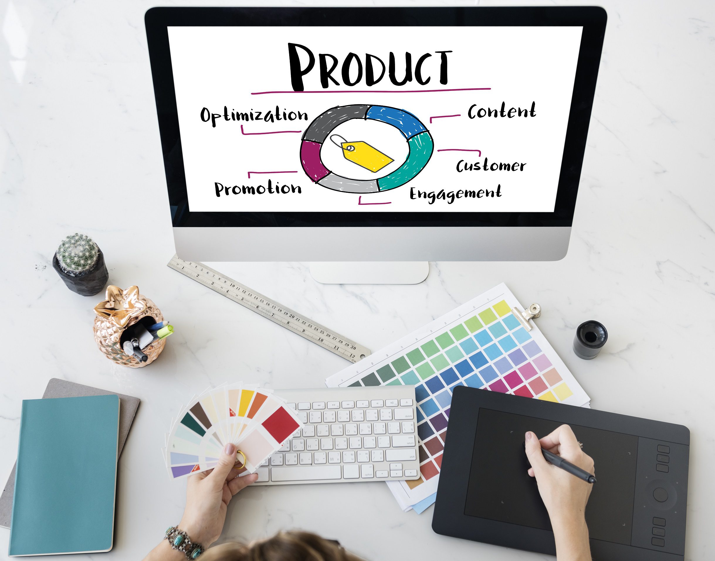
UX (or user experience) design has become a hot topic in every industry, and travel is no exception. As consumers are booking more and more features of their trip on the go – from the hotel room to the paddle boat tour, and transportation in between – a hassle-free and even enjoyable website could make or break your business.
First off.. what exactly are we talking about here?
Basically, UX design entails the process of manipulating user behavior through usability, usefulness, and desirability provided in the interaction with a product.
What you’re trying to do here is create a product – usually a website or app – that understands the visitor and therefore pushes them towards an action. In tourism, this action is usually a booking. All web and digital agencies should help you through this process, but it is important that you understand its power too!!
Here are a few tips for improving your site’s UX design, specifically geared for travel and activities brands.
Conduct User Research
User research is an important aspect of developing a UX design that works for your target demographic. In the case of hotels and activities, you’ll want to know a few specific question about your highest-converting audience:
- What type of traveler are you appealing to? A business traveler may have different booking priorities than a luxury traveler or a back-packer.
- What are their favored devices? You can reference Google Analytics data to find out where most of your conversions happen.
- Why do they choose you over a competitor? Whatever it is that attracted them in the first place, infuse that element of your brand into every aspect of your site and booking path.
Chances are, you can likely find answers to these questions through existing analytics and customer surveys. The key is to ask them in the first place.
Match Their Travel Personality
Once you have a pretty clear idea who your customer is, you’ll want to mirror their priorities in your design, colors, and booking features.
If you offer high-dollar, private tours, then be sure to make all of the trip details and contact info easy to find throughout the booking process – these customers are probably planning their trip in advance, making sure every detail is ironed out. For activities that tend to draw in larger crowds at a lower price ticket, like a two-hour walking tour, the website and booking process can be simplified: make sure customers can easily book a reservation on their phone as they’re leaving the restaurant.
Keep your target demographic in mind, and design the look and feel of your website to speak to them and their needs.
Relieve Pain Points Wherever Possible
Great UX design is successful when it feels totally natural and cohesive to the end-user. Try to imagine the questions your customers might have as they book, and deliver answers exactly when it feels appropriate.
Is the cancellation policy clear before they pay up? Do they know their booking confirmation immediately, or have to wait for an e-mail the day of their reservation? Providing this information in a clear and efficient way could save you a ton of customer service calls down the line, and make for a better user experience overall.

Keep It Cohesive
You might use a different content management system for your landing pages, blog, and booking platform – but try not to let it show.
Customers notice even the most minor changes, like variation in colors, fonts and logos – and these small inconsistencies could cause them to lose trust in the site, and decide not to pull out their wallet.
So keep your site or app as cohesive as possible. And consider ways that your design could help build trust for new users, like having a visible header with your logo and contact info on every page.

Use Video to Your Advantage
Striking visuals can inspire and motivate users – and ultimately, earn you more bookings. And great videos add that extra dimension that keeps users on your site or in the app just a little bit longer. Incorporate video of your destination or experience to set the tone, and get them excited to vacation with you.
Brands are also increasingly making their videos interactive, with 360 views and VR technology. It’s certainly not a necessity, but if it’s in the budget, consider ways to add to the user experience and exceed expectations.
No matter what form of video you use, keep the rest of your design relatively simple. You’ll want a clean, inviting canvas to make your imagery really pop, and let the destination speak for itself.
Build Trust through Transparency
Keep in mind that your website and booking platform create the first impression of your brand. So present a trustworthy image, and make your pricing clear and consistent. Building in hidden fees that only pop up in the payment screen is a great way to lose a customer. While that client may continue to book with you, don’t expect to get their business again when they return.
Hopefully, your web design is working for you – not against you. But if you have doubts or think there’s room for improvement, we’d be happy to take a look at your site and share our thoughts. Let’s chat.
Do you have a favorite travel site that uses impeccable UX design? We’d love to geek out with you! Share your UX goals with Von Mack on LinkedIn or Facebook.